LogoGeneratoris.com
Unique AI Logo Generator
Color Psychology in Logo Design for Your Company
When designing a logo for your company, color is one of the most crucial elements to consider. Color psychology, the study of how colors affect perceptions and behaviors, can significantly influence your brand’s impact on potential customers. This article delves into the nuances of color psychology and how to make informed choices to create an effective and memorable logo. 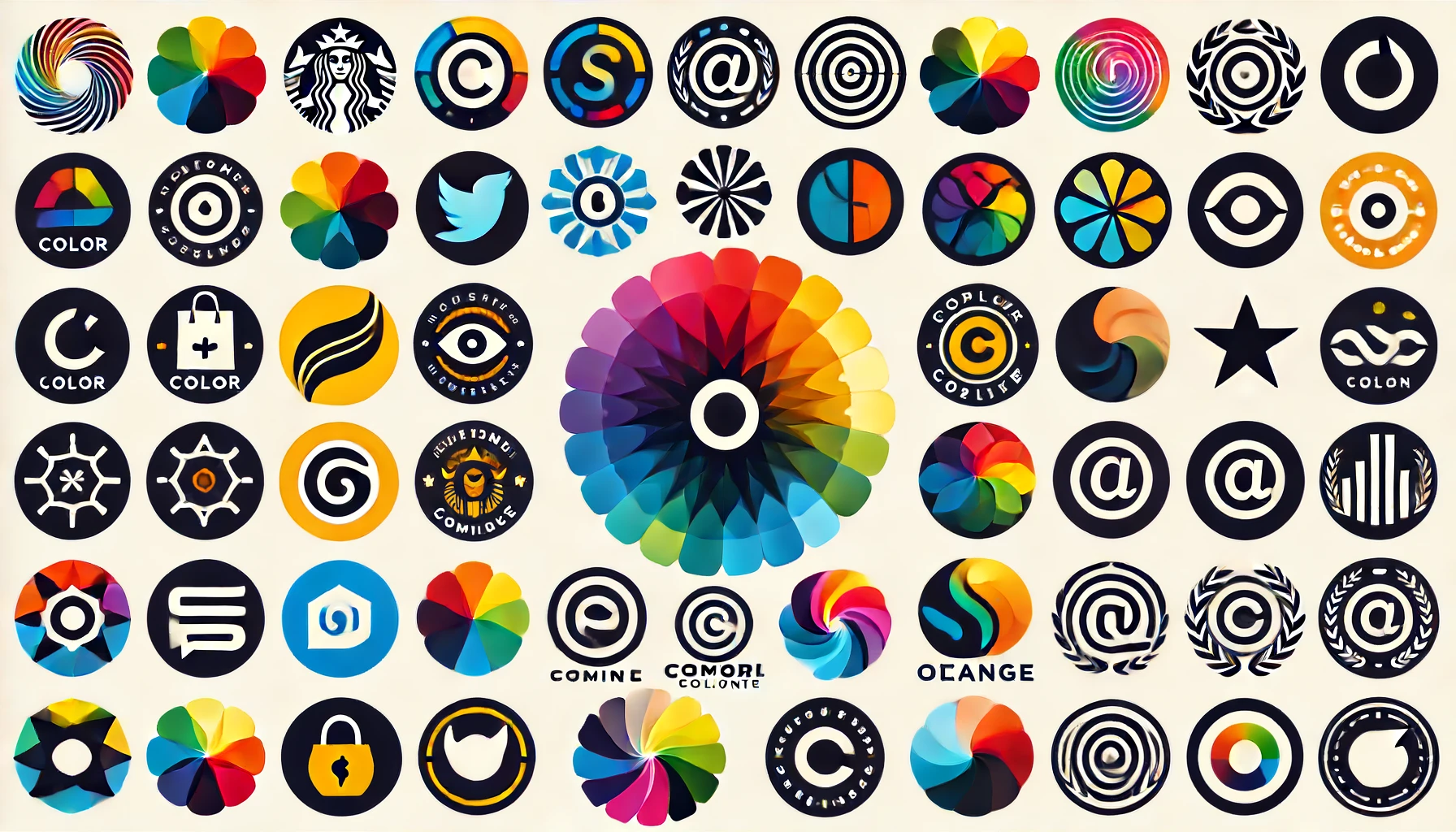
The Basics of Color Psychology
Color psychology explores how different hues evoke various emotions and associations. It’s a powerful tool in marketing and branding because colors can trigger psychological responses that influence purchasing decisions. Understanding the emotional and cultural connotations of colors can help you choose a logo color scheme that aligns with your brand identity and appeals to your target audience.
Red: Passion, Energy, and Urgency
Red is a dynamic and intense color that grabs attention and elicits strong emotions. It symbolizes passion, energy, and urgency. Brands like Coca-Cola and Netflix use red to create a sense of excitement and to stand out. However, because it’s so stimulating, it’s essential to use red sparingly to avoid overwhelming your audience.
Blue: Trust, Calm, and Reliability
Blue is often associated with trust, calmness, and reliability. It’s a popular choice for corporate logos because it instills a sense of professionalism and dependability. Companies like IBM, Ford, and American Express use blue to convey stability and trustworthiness. Blue is also versatile, suitable for various industries, from technology to finance.
Green: Growth, Health, and Tranquility
Green symbolizes growth, health, and tranquility. It’s strongly associated with nature and sustainability, making it an excellent choice for brands focused on eco-friendliness, wellness, or agriculture. Companies like Whole Foods and Starbucks use green to highlight their commitment to health and the environment. Green’s calming effect can also make your brand appear more balanced and refreshing.
Yellow: Optimism, Warmth, and Caution
Yellow is a bright and cheerful color that conveys optimism and warmth. It can evoke feelings of happiness and positivity, making it an excellent choice for brands that want to appear friendly and approachable. McDonald’s and IKEA effectively use yellow to create a welcoming atmosphere. However, because yellow is also associated with caution, it’s crucial to balance it with other colors to avoid negative connotations.
Purple: Luxury, Creativity, and Mystery
Purple combines the stability of blue and the energy of red, resulting in a color that signifies luxury, creativity, and mystery. It’s often associated with royalty and sophistication, making it ideal for brands in the fashion and beauty industries. Companies like Cadbury and Hallmark use purple to add a touch of elegance and creativity to their brand image. Purple can also stimulate problem-solving and innovation, appealing to a more imaginative audience.
Orange: Enthusiasm, Creativity, and Adventure
Orange is a vibrant and energetic color that blends the warmth of red and the cheerfulness of yellow. It conveys enthusiasm, creativity, and adventure, making it a great choice for brands that want to appear fun and innovative. Companies like Nickelodeon and Fanta use orange to attract a youthful and dynamic audience. Orange is also less intense than red, providing a stimulating yet balanced effect.
Black and White: Sophistication, Simplicity, and Elegance
Black and white are timeless colors that convey sophistication, simplicity, and elegance. Black is often associated with luxury, power, and authority, while white symbolizes purity, cleanliness, and simplicity. Brands like Chanel and Apple use these colors to create a sleek and modern look. A black-and-white logo can be very versatile and adaptable, fitting well with various designs and color schemes.
Combining Colors for Impact
While individual colors have their own psychological effects, combining them can create a more comprehensive and impactful brand message. For example, combining blue and green can convey a sense of trust and environmental consciousness, while pairing red and yellow can evoke excitement and optimism. It’s essential to consider how different colors interact and support your overall brand identity.
Cultural Considerations
Color meanings can vary across different cultures, so it’s crucial to consider your target audience's cultural background. For instance, while white signifies purity in Western cultures, it can represent mourning in some Eastern cultures. Understanding these cultural nuances ensures your logo resonates positively with a global audience.
Conclusion
Choosing the right colors for your company logo is more than just an aesthetic decision; it’s a strategic move that can significantly impact your brand’s perception and success. By understanding color psychology and considering your brand’s values and target audience, you can create a logo that not only stands out but also communicates the right message. Remember, the right color can evoke the right emotion, making your brand more memorable and influential.
Latest Posts on AI and Logos:
AI Generated Business CardsAI Generated Logos vs Human Artists
AI Generated Logos
AI Logo Generators
AI Mascots and Logos
Collaborating with AI Generators and Artists for the Perfect Logo
Color Psychology in Logo Design
Creative Logo Importance
Future of AI Generated Logo Designs
How AI Can Help You Generate a Creative Logo
How to Choose a Mascot for Your Company
How to Choose Your Logo
Importance of a Good Logo
Low-Cost AI Generated Logos
Neuroscience for Logo Branding